- Projects -
- About Me-

Hiya!
I'm Hugo, a Swede with a caffeine fueled smile and a life based on questionable (read a carefully thought out) life decisions.
Still don't know who I am?
I'm the guy who's still humming on early 2000-hits while binge watching the latest UFO documentary.
I'm the person who's questioning if my obsession with animatronic puppets comes from
"Turtles", "Gremlins" or "The Thing"... I still don't know.
My philosophy:
Life is a construction site and a treasure map at the same time - equally discovering and creating yourself.
Translation:
My main driving force is curiosity and learning new things.
I love to explore and create stilistic experiences with a clear vision and I tend to gravitate towards games with deep emotional impact.
Want to collaborate?
Me too! Feel free to reach out and I'll respond as soon as I'm able.
Overview:
"Look at classic games such as “Frogger“ and Create a simple little game, focusing
on learning the various aspects of C# and working with primitive shapes in Unity.""Take inspiration from old and primitive games which center around a single mechanic, centered around moving with two buttons and maybe firing a projectile."
Context:
Student Assignement
School:
FutureGames (2024)
Team:
Solo Project
Course:
Programming for UX
Duration:
3,5 weeks
- COMPETITOR ANALASYS -
Context:
For this assignement I chose to combine one of my all time favourites "Metal Gear Solid" with Frogger.
Defining the experience:
1. The player starts at the bottom, hop to the top into the pond, and repeat until three frogs make it across to win.2. Player progression is blocked by blinking mines; if green you can jump on them, if red they explode.3. There are patrolling guards that will shoot at player if they see him/her.4. There are searhlights that will alert all guards to player location if caught and order them to shoot.5. There are trains running across the screen which will kill the player instantly if it hit. (cars from original "Frogger")
- GRAY BOXING -
Shapes:
Based on the defined experience a full asset list was created to determine what the full scene consists of.Scaling:
Simple sprite geometry was created and put in place to define objects scale and placement in the scene.Simple Logic:
Enemy behavior tests turned idle guards into patrolling ones after balancing issues—player detection disrupted
look \patterns, creating exploitable gaps in patrol coverage.Pacing:
Level flow was experimented upon by moving around objects and playing around with spawn time for the train.
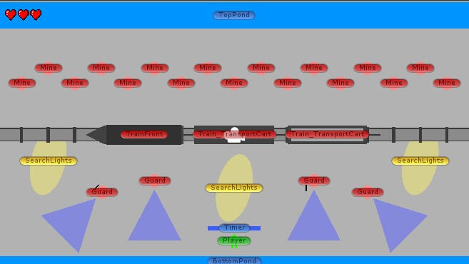
Grayboxing: Initial planning using simple shapes and color.
- IMPLEMENTATION -
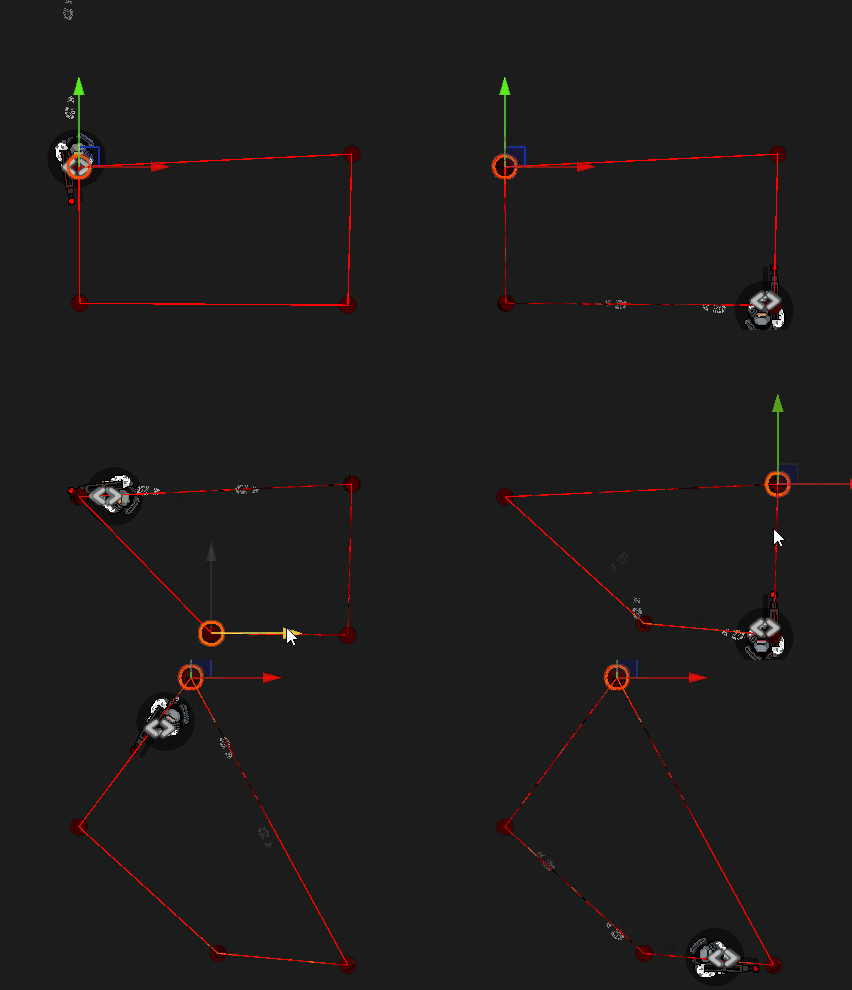
Custom made tool: dynamic AI-Behaviour.
AI-Behaviour:
"HOW MIGHT WE CREATE EASY TO USE AI-BEHAVIOUR TOOLS?"
Dynamic:
To streamline development I created a node based ai tool that could be updated during runtime. To figure out interesting patrol patterns quickly.Scalible:
The tool supports unlimited nodes in the scene, each with
its own behavior script, enabling complex AI behavior chains.Easy to use:
Simple Usability: place a prefab node into the “next node” slot—its instructions play automatically when reached.
- POLISH -
Visual & Audiotory feedback:
"HOW MIGHT WE CONVEY WHEN MINES CAN BE STEPPED ON?"
Visual:
Mines flicker between red and green to create a light puzzle element—green means safe to cross, red means danger.Audiotory:
Audio cues reinforce visuals: a sharp “beep” signals safe (green), while a softer one warns of danger (red), helping players time their movement.
Audio/Visual Cues: sound cues reinforce visual blinking.
REFLECTIONS:
WHAT WENT WELL:PLAYER GUIDENCE: Due to conventions such as "Color Coding", "Breadcrumbing" & "Leading Lines." AFFORDANCE: Players understood what they could do, where they should go & how to manouver hazards.
WHAT WOULD I IMPROVE:TUTORIALIZATION: Ramp up difficulty over time by introducing several levels with 1-3 hazard per level.LEVEL DESIGN: Several players reported a "golden" path that they kept using once figuring it out.
MAIN TAKE-AWAYS:- Don't get stuck on developing complex mechanics simply because they sound interesting, rather rapid-prototype -- Making a mechanic into an easy to use visual tool saves alot of time and makes game design far easier -- Have regular playtests throughout development and listen to feedback in order to balance the game-experience -
- contact information-
Overview:
"Design a game centered on the concept and word “FUN” - interpret the theme in your own way.""Go through the full game production pipeline: Brainstorming, ideation, pitching, greenlighting, Alpha & Gold Builds.""Release the game with a complete suite of marketing assets and materials."
Context:
Group Assignement
School:
FutureGames (2024)
Team:
15
Course:
Game Project 1
Duration:
3 Weeks
- BRAINSTORMING -
Context:
"The team was split between my pitch — a child at a carnival imagining balloons closing in as enemies — and my teammate’s idea about a toy protecting a sleeping child from nightmares. We combined my pitch’s mechanics and perspective with her setting and concept."
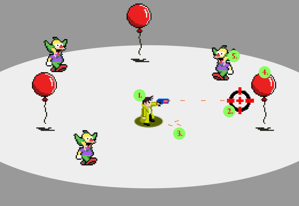
Pitch 1:
Shoot baloons
Final Pitch:
Top view + shield throw
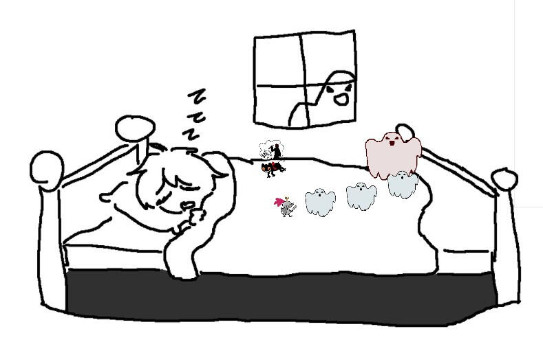
Pitch 2:
Defend child with sword
- COMPROMISE -
Context:
"Since my ideas shaped the core concept, the producer made me co-producer and put me in charge of supervising the Game Design Team, while the Creative Director supervised the Artists. We then collaborated to ensure the overall vision was kept.
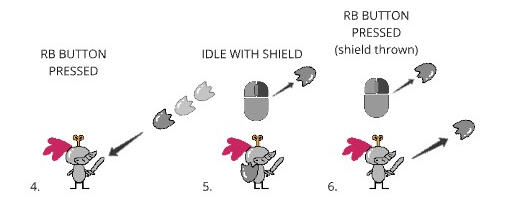
Conveying ideas about button prompts
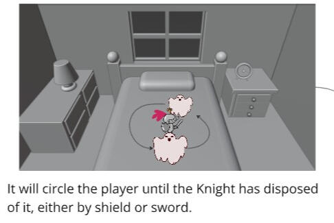
UX contributing to the Game Design
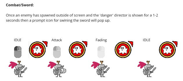
Tutorializing using first use prompts
- UI-Design -
Context:
I wanted the UI to be a part of the epxerience and draw the player in. I matched the menues to our concept artist’s color profile and visual language. Taking into account that the experience was intended for a younger audience I exaggerated the porportions.
Main Menu:
"HOW MIGHT WE PREPARE THE PLAYER FOR THE EXPERIENCE?"
Concept:
Using a "living” background from the actual level I tried to prime the player and set expectations of what to come.Tone:
I aimed for an exaggerated, playful tone that would intrugie a younger audience — from a reactive ustom cursor to slightly moving menus that gave clear feedback.
Player Feedback:
"HOW MIGHT WE CONVEY DAMAGE TAKEN TO THE PLAYER?"
Context - Stunned:
When the player takes too much damage, they become stunned and frozen in place.Visual cues:
I tried to include as many conventions as possible to convey a "stun" effect. By turning the character blue I could suggest that the player was cold/frozen and thus "stuck" in place" while quick camera shake and chromatic aberration effect suggested impact and dizziness.Audio cues:
A playful bird chatter together with animated sprites of birds that circled the player emphasized the effect while keeping in line with a lighthearted, cartoon-style “dazed” effect.
Showcasing the finalized stun effect.
Showcasing the finalized button prompt to recall shield.
Button Prompts:
"HOW MIGHT WE TEACH THE PLAYER TO RECALL THE SHIELD?"
Decision:
Button prompts were chosen for their simple yet direct nature in communicating information.Placement:
The prompts needed to be noticible at all times. Early on, I placed them above the player’s head but testing showed that players rarely looked there.Iterations:
Based on User Research I decided to place the prompts near the cursor and added a slight animation to try and draw player focus and suggest interaction.
- DIEGETIC DESIGN-
Context:
As a personal challenge I designed the experience around a diegetic design pattern, not only because
of the imersion it could bring but also in terms of reducing clutter and maximize situational awareness.I created a traditional UI for the Alpha presentation to get us through greenlight but it also served as a reliable fallback in case the diegetic approach didn’t come together in time for the Gold build.
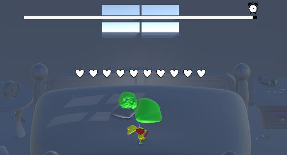
Fallback: traditional UI-Design.
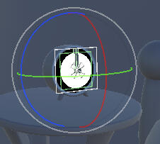
Deagetic implementation in scene.
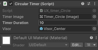
Simple tool I created for the designers.
Diegetic Timer
"HOW MIGHT WE VISUALIZE A TIMER USING GAME WORLD?"
Day/Night Cycle:
To convey a timer without obstructing the player’s view, I turned it into a day/night cycle (a concept of time passing we can all intuitively understand.Alarm Clock:
In case the day/night cycle wasn't conveyting time passing clearly, I also placed a functioning alarm clock on the night stand that moved in tandem with the day/night cycle.
Showcasing day/night cycle in tandem with alarm clock timer.
Showcasing sleep markers in tandem with child breathing.
Diegetic Sleep-Indicator:
"HOW MIGHT WE CONVEY CHILDS HEALTH USING IN GAME WORLD?"
Health icons:
What began as simple health icons above the child evolved into animated sleep markers that grew more red and erratic as the player took damage.Reinforcement:
To ensure the player corraleted the sleep markers with the child's "health" I paired the childs sleeping animation to speed up the more damage the child took.
REFLECTIONS:
WHAT WENT WELL:TOP-DOWN COLLABORATION: From producer, to creative director and the rest of the team. COMMUNICATION: The core concept was clearly communicated and understood during entire project.
WHAT WOULD I IMPROVE:TUTORIALIZATION: As there still's still confusion reagarding core concepts there is room for improvement.PLAYER FEEDBACK: I would look into adding haptical feedback as a means to communcate infromation. -
MAIN TAKE-AWAYS:- UI is not about blending in but about drawing attention with contrasts -- How I communicate is as important as what I communicate-


